Some texts effortlessly catch our attention while others struggle for it. I’ve been exploring the ‘why’ behind attention-grabbing texts. I noticed something contradictory to a common opinion: texts that make you stop what you’re doing need not have sophisticated copy. In fact, I came across a handful of striking texts with plain copy.
I mean, look at this:

A Chipotle Billboard Ad
And this:

A WLM Homelessness Campaign
What then is the secret behind texts that trap our attention and push us into taking actions?
The Devil’s in The Design.
The picture becomes clear when everything is seen as a system. A system is an entity with multiple components that are dependent on or independent of one another. Following this theory, textual information is a system – and its components are texts.
Fundamental to the functioning of any system are models. Models are responsible for how designers create systems and how humans interact with them.
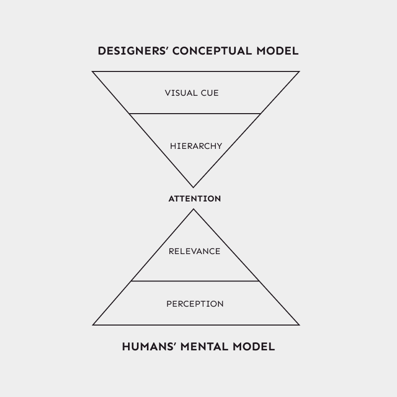
Designers use conceptual models – a plan for how a system will function, when creating a system. A conceptual model is made up of elements that shape the organization of a system’s component.
On the other hand, humans use mental models to interact with a system. A mental model refers to our understanding of how a system works. It’s formed based on what we already do, our prior experiences with similar systems or assumptions we’ve formed based on the appearance of a system.
When creating a system, designers focus on making a conceptual model that aligns with the mental model of humans. Designers achieve this by investigating the deep motivations and thought processes of humans. Consequently, a system that feels like a natural extension of humans is created.
The conceptual model employed by text designers blends with our existing mental models for other systems. This results in texts that hold our attention and are easy to comprehend.
Relevance: A Mental Model For Humans
Our brain is always processing systems. This helps us interact with them accordingly. Relevance is one of the mental models used by our brain to process and interact with systems.
The relevance mental model processes each component of a system based on its level of importance. Components considered to be more important are ranked high. These components are easily recalled or recognized by the brain. Conversely, less important components are ranked low and barely noticed.
Whenever we encounter a system, relevance guides our decision-making process and the brain involuntarily focuses on the components deemed more important.
Hierarchy: A Conceptual Model For Textual Information Designers
As mentioned earlier, the components of a system have varying levels of importance. This also applies to textual information — some texts are more important than others.
Hierarchy is one of the conceptual models employed by designers to create textual information whose texts have different levels of importance. This is achieved through the use of elements that structure the texts.
The elements used to demonstrate hierarchy in textual information are known as Visual Cues. With visual cues, emphasis is given to some texts over others, thereby effectively communicating the difference in importance between them.
Relevance × Hierarchy: What Happens When Texts Grab Our Attention?
For texts to hold attention, the hierarchy conceptual model must align with the relevance mental model.
The brain notices the visual cues of each text. Subsequently, our relevance model is stimulated and the brain assigns different levels of importance to each text. As a result, some texts hold our attention and others don’t.

The visual cues used by designers to implement the hierarchy conceptual model include: size, weight and/or opacity.
Size
By varying the sizes of texts, designers demonstrate the hierarchy conceptual model. Texts deemed important are designed with big fonts. The brain notices the difference in sizes then uses the relevance model to direct our attention onto the bigger texts.

In the example above, the texts whose font size is big caught your attention before the small ones. The visual cue of size stimulated your relevance mental model, which drove your attention to the bigger texts.
Weight
Weight is another visual cue that depicts hierarchy. Designers apply a bold font weight to more important texts and light font weight to less important texts. The brain detects the difference in font weights and involuntarily directs our attention onto the texts with bold font weight.

In the example above, you noticed the texts with bold fonts before the light ones. This is due to the difference in font weights, which served as a visual cue and stimulated your relevance mental model.
Opacity
Opacity is the degree to which something allows light to pass through it. In the design of texts, opacity is responsible for its level of transparency. A text with high opacity has low transparency, hence light can’t pass through it. Conversely, a text with low opacity has high transparency, thus allowing light to pass through it.
Designers of textual information use opacity to create hierarchy between texts. More important texts are designed with high opacity while the less important ones have low opacity.

In the design above, your brain perceived the difference in opacity between the texts then involuntarily stimulated your relevance model. As a result, the more opaque text caught your attention before the less opaque ones.
Designers of textual information use one or a combination of these visual cues. So when next you come across a text that traps your attention, know it’s not accidental – it’s designed to do just that.
